Media
Contests
Vehicles
Technician's Advice
Spare Parts Corner
Editorial
Events
Body Care
Previous
Next
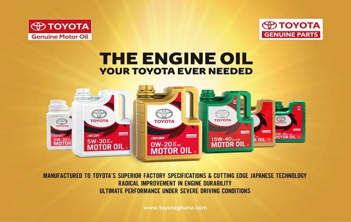
Toyota Genuine Motor Oil
Spare Parts Corner
|
admin
Legon Branch is Open for Business
Media
|
admin
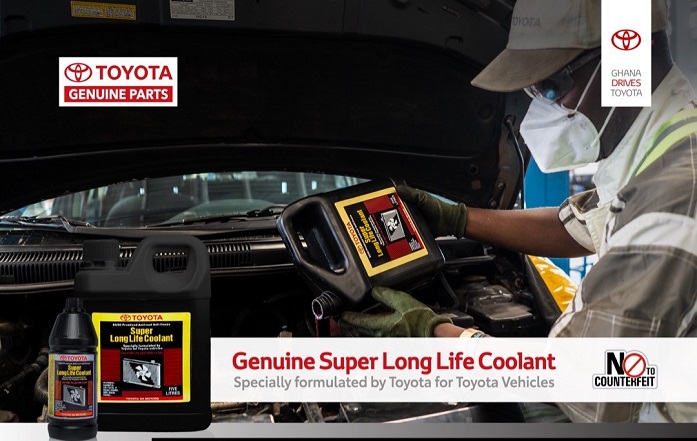
Why you should use a coolant instead of water
Technician's Advice
|
admin
Limit Speed
Editorial
|
admin
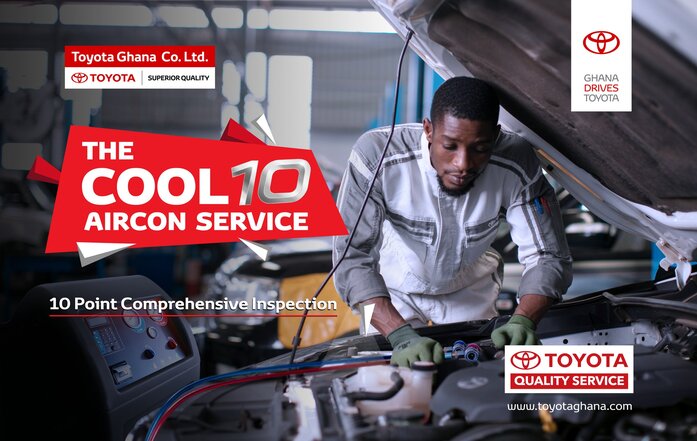
Bring your Toyota Home- The cool 10 Air Care Service
Body Care
|
admin
×
Toyota Genuine Motor Oil
2022-10-17
admin
Genuine Motor Oil, TGMO, Maintenance
Legon Branch is Open for Business
2022-09-02
admin
Toyota, Legon, Quality Service
Why you should use a coolant instead of water
2022-08-19
admin
Coolant
Limit Speed
2022-08-17
admin
Safety, Speed limits, Road Safety
Bring your Toyota Home- The cool 10 Air Care Service
2022-08-17
admin
Air Condition Care, AC Servicing
Spare Parts corner- Evaporator Cleaner
2022-08-17
admin
Evaporator, Air Condition Care
Body Polishing and Waxing
2022-08-17
admin
Bodyworks, Polishing, and Waxing
5 Easy Fuel Economy Driving Tips
2022-08-17
admin
Fuel Economy, Save, Toyota
View More